What’s included within the iMovie?

What’s included within the iMovie?
QUALITATIVE DATA:
![image[1]](https://larafalzona2.files.wordpress.com/2015/02/image1.png)


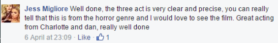
From having uploaded our horror trailer to the social network of Facebook, we were extremely pleased with the feedback we received. Examples of comments were that the horror genre was obvious and that the music fit well with the sequence. This was very beneficial as it allowed us to know that we had met the specification that we were eager to meet. Comments that really stood out were that lots of people were interested to go and see the film. This reassured us in a way that we knew we had made the trailer right as a large purpose of a trailer is get people to want to pay to go and see the rest of the film. Another comment that particularly stood out was that someone thought out target audience would be 15-24 year olds, we were very pleasing when seeing this comment as it meant that we had advertised for our target demographic in the right way.
HORROR GENRE

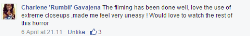
From the first comment, it is clear that the person felt our horror genre was made evident through the use of mise-en-scene. This means that we used all the right props, for example fake body parts in order to express our horror genre. The second comment is also supportive of this horror genre as they said that the use of close ups made them feel uneasy which is the exact feeling we wanted them to experience, and she also refers to our film as a horror. This makes us pleased to know that our genre was portrayed in the right way to our target demographic.
NON-DIEGETIC MUSIC


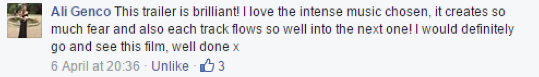
We received very positive feedback on the non-diegetic music used within our trailer. Due to using numerous tracks, there was always the idea that they might not all be accepted by the viewers, so to receive the feedback that the music in general was effective was incredibly reassuring. Also, as you can see from the comments, the music was appreciated on all sorts of levels, ranging from it fitting in well with the sequence to it creating a ‘build up’ vibe. This allowed us to know that our horror music brought out many emotions within our audience in all sorts of positive ways. Having feedback saying that the music fit well with the sequence expressed that our editing skills were key when attaching the music to the filmed footage.
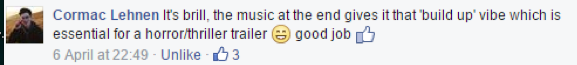
THREE ACT STRUCTURE
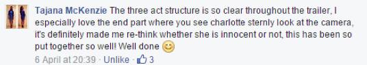
A crucial part of a trailer is that it includes some type of structure. We decided to follow the three act structure, which is typical of most existing horror trailers. As you can see from the above comments, our three act structure was clearly recognised.
TARGET AUDIENCE

From having got 138 likes on the horror trailer we uploaded, we were very grateful to see so many people were pleased with our finished product. This pilot exercise allowed us to get the feedback we needed before reaching other existing film markets to sell and promote our film.

QUANTITATE DATA:
In order to gain insight as to how effective our horror media package was, we created an online survey on ‘Survey monkey’ where we got 50 people to fill it out, giving their own opinions on our work. We made sure a lot of the participants we asked were included within our target audience of 15-24 year olds as this is the market we would be reaching out to. This was very useful to do as we were able to see what worked well and what could have improved.
Link to our Surveymonkey: https://www.surveymonkey.com/s/L83B8XP

When creating the main product of our trailer, we knew it was integral to make the genre clear to the audience viewers in order for them to know if it was a film they would be interested in seeing. We did this through many ways such as using fearful non-diegetic music and uncomfortable close up shots. The audience feedback we have received is incredibly promising as 94% of participants said that they thought the trailer was under the horror genre category. This therefore expresses that we achieved the aim of wanting to make it clear what our genre is. A main reason as to why this was most likely achieved is that we made our act two of the trailer (which was the kidnap scene) a very long and bulky one out of the three, as we knew this was where our horror genre was really stressed. This was due to the masked villain being present and the typical conventions of a horror film such as the doorbell being rung but no one being outside or a noise being heard from upstairs, being shown on screen. All these elements helped to really argue that our film was a horror film. However, as shown 6% of participants believed that our film fell under the thriller category, however, this can be seen in both a positive and negative light. A positive light as it shows that our film can be read as a hybrid in the sense that it includes elements from another genre and therefore would be open to attracting more viewers. A negative light possibly being due to the thriller and horror genres overlapping as they can both include themes of suspense and mystery, we should have made it extremely clear our film was a horror. Thrillers are said to evoke terror, and this might have been something we fell into the trap of doing. This could have been improved in including more of the colour red as this is typically a colour involved in horrors, and this could have been done with the character of Charlotte wearing red or the mask for example. However, we didn’t want our film to fall into the stereotypical horror genre as we felt this would sell well. Instead, we wanted to create a new modern outlook on films where a sense of thriller being involved in a horror film is exciting to view.
100% of participants felt that our film would appeal to the age group of 15-24 year olds. This is very good feedback as no one thought differently. We knew that this was going to be a good target audience to focus on shaping our film towards as many surveys over past years have found this age group to be the most constant cinema goers, such as the ‘National consumer study 2009’ which found that 82% of 15-24 year olds had gone to the cinema in the last 6 months. Due to this research, we knew that our film would have great potential with this specified target group. Another reason we chose this target audience is due to this age group thoroughly enjoying the horror genre. Lastly, we followed the ‘British Board of Film Classification’ (BBFC) in order to determine what age group our film would be most suitable for. When speaking to some of the participants after the survey, we received verbal feedback that our film seemed best suited to this chosen age group, however would also attract the likelihood of other age groups such as those aged 25-40. This was beneficial feedback to receive as it means that although our film reached a specified target audience, it also has the potential to appeal to a wider audience, meaning that we have required a large audience. Also, due to no one suggesting that the film would be suitable for someone younger than the age of 15 means that we were right to classify the film as certificate 15. Due to all our survey participants believing our film to appeal most to 15-24 year olds, we have gained confidence in the insight that we have structured our trailer in the right way so that people understand who the target audience is. Moreover, due to some of the people filling out the survey of an older age and still stating that they felt our target audience would be 15-24 year olds means that we have required a very evident target audience.
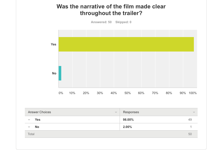
When creating the narrative of our film, we realised we were very interested in the psychological sub-genre where we could have the control and manipulate the audience in a certain direction and then surprise them later on. We therefore researched films such as ‘Gone Girl’, which included a narrative that tricked the audience and observed the way in which the trailer was put together. 96% of survey participants said that our narrative was made clear throughout the trailer and they understood it. This therefore shows that we did very well in creating a trailer which gave an all round look into the film as a whole, therefore letting the audience gain knowledge as to what the film was truly about. This was achieved by creating a clear three-act structure as this way we could show elements and features of the beginning, middle and end of the film, thus expressing the narrative.
We made sure to keep to the typical three act structure used within a horror film trailer (The Art of first impressions- How to cut a movie trailer- Stephen Garrett). This allowed us to be able to stick to the codes and conventions of existing horror forms.
However, 4% of participants said that the narrative was not made clear throughout the trailer. This was not received as negative feedback though as we purposefully wanted the trailer to not give the entire narrative of the film away on a plate, as the point of a psychological horror is to confuse the audience as to what the true and real narrative is. We structured our trailer in the sense that we showed the character of charlotte being a vulnerable victim of a kidnap and then revealed within the very last seconds of the trailer that what the audience had just seen of Charlotte could potentially have been a facade. This therefore could have been taken in by the minor 4% of participants as a miscommunication of narrative throughout the trailer, however this just means that they could be further interested to want to go and unsolved the confusing narrative by going and seeing the film itself.

When selecting the non-diegetic music for the trailer, we wanted to include a range of tracks in order to highlight the switch in scenes and emotions being explored throughout the trailer. We therefore decided to use a total of four tracks as we felt this would withhold the exciting pace of the trailer. However, we were careful to select pieces that consistently expressed the horror genre, as we took into consideration how important music is in order to portray a chosen genre. We felt that by using numerous different horror tracks, it would create a chaotic atmosphere for the audience and build the levels of confusion being produced. Furthermore, it would really stress the horror genre as the viewers would be getting a wide look into the sorts of fearful music available within horror films. We were inspired by the music used by films such as ‘You’re Next’ where the equilibrium of the trailer used warm music to express that this was the first part of the three act structure, where everything is calm. The music then changed to a more sinister track when the tone of the trailer changed to a more fearful one. We too, decided to structure the music of our trailer in this way with the intention in mind that it would allow the audience to really acknowledge the horror genre. 100% of participants said that they felt the music was effective in expressing the genre. One reason this may have been the case is due to us sticking to the codes and conventions of a horror genre and existing horror forms. These results allowed us to gain the knowledge that the right tracks were chosen in order to consistently express the dark horror genre.
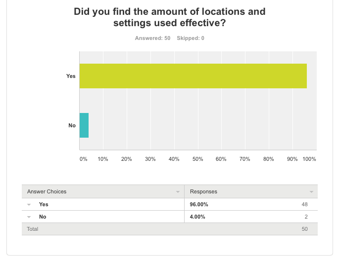
After researching many horror trailers, we realised that many of them tended to set it up in one setting and/or location. Examples are ‘The Strangers’ and ‘You’re Next’ which both chose to set their film in the setting of a house. Due to the fact, both films included a masked villain and some sort of break in, we acknowledged the fact a house was used and also decided to predominately use this setting for the duration of our trailer. This was for the reason that we knew a house represented security and warmth and we felt that by challenging the set view in people’s minds, it would fear them deeply. Also, we felt that it would create a scary relatable picture to the viewers as most watching would be living in a house and so to see something like that take place in that specified setting, it would only just raise the levels of fright within them. 96% of participants who took part in the survey said that they felt the amount of settings and locations used were effective. This was beneficial to see as it meant that we used just the right amount as sometimes trailers can fall into the trap of overusing many different settings to make it appear exciting, however this can just make it too over complex and not appealing. We therefore thought that taking a more simplistic approach with the amount of settings and locations used would be a more effective way of reaching out to an audience and creating a narrative. The settings and locations we used were a house, a forest, outside the house and an unknown tunnel in Waterloo. These locations combined helped to create an eerie feel as the lack of change to each location creates a feeling of unease. However, 4 % of participants said that they felt the amount of settings and locations were not effective. This could be due to them feeling the need for a larger amount of locations, more similar to films such as ‘We need to talk about Kevin’. To improve this, we could have increased the amount of settings and locations used to create a variety. However, we felt that the less used, the more suspenseful the atmosphere would be.

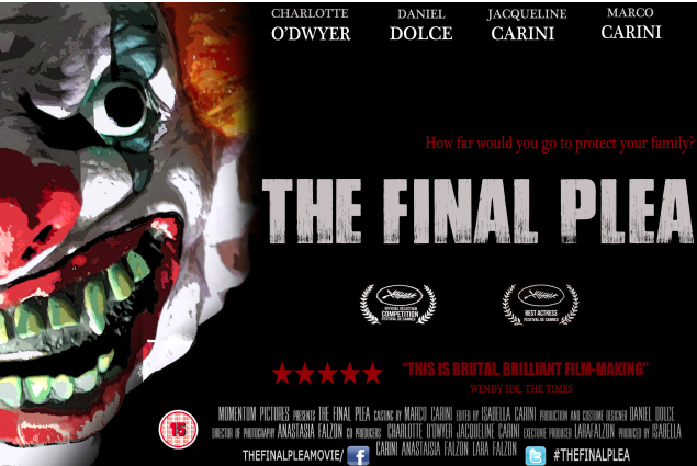
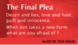
For the title of ‘The Final Plea’ we wanted to make sure that it tied in well with the rest of the package and this was done by using the same tittle as the one on the poster. However, we still wanted it to be independent to the trailer itself and this was done by making it flash to a cut out title from the body parts used. This created an uncomfortable feeling and allowed a sense of shock to reach the audience. The title of a film should wrap up all the feelings, themes and emotions produced within the film, into one. It should also prioritise the genre of the film in order for the audience to know instantly what kind of film it is advertising. We therefore hoped that when creating the title that it would achieve all these things and more. When receiving feedback, we were very pleased to see that our hopes had been achieved as100% of participants said that they felt the title of ‘The Final Plea’ was effective. This is very good feedback as it means that all participants felt that the title was of a high standard and this is an important feature of a trailer and film as it is representing the whole film. One reason why we gained the very positive results that we did is due to sticking to the codes and conventions of a horror genre and other existing horror forms.

A very key point which needs to be kept in mind when creating a trailer is that it needs to lead people on to want to go and see the whole film itself. Stephen Garrett in the ‘The Art of First Impressions’ mentions this where he states that an important intention of a trailer is to intrigue audience viewers to want to go and see the rest of the film. We therefore kept this aim in mind and created as much mystery as we could. This was done by leading the audience on to think that the character of Charlotte was the victim throughout the trailer and then last minute showing her in a dark and sinister way. By doing this we knew it would lead the audience into wanting to discover what had really happened with Charlotte and therefore paying to go and see the rest of the film. This aim was achieved as 100% of participants said that from having seen the trailer, they would want to go and see the film. This therefore means that we created the trailer in the exact right way, as the whole point of a trailer is to give the audience a taster into the film itself and lead them to go and see the rest of the film.

When creating the ancillary product of the poster, we knew that the genre of the film had to show through. We therefore conformed to typical horror elements such as making use out of the colours black and red throughout both the imagery and the text itself. For example, we used a black background and red text for the tag line. These features helped to evoke an obvious horror genre. We took inspiration from the poster of ‘Annabelle’ as an uncomfortable side close up shot was used of a doll and we felt this was incredibly fearful. We therefore decided to use a very extreme side close up shot of our masked man character as we felt that by doing this it would make the audience feel targeted and victimised. 100% of our audience feedback said that they felt the poster was effective in conveying the genre. This not only means they acknowledged what the genre of the film was but also that they felt the poster conveyed it well. This feedback was useful to receive as we personally felt that the poster showed off the horror genre extremely well due to the typical elements of a horror being included. Due to the poster being such an important part of the film process as it is what viewers are seeing everywhere they go and its what represents the film, this is extremely good feedback to receive.

We decided to use the magazine company of ‘Electric Sheep’ when creating our magazine as it does extremely well in promoting independent films. In modern day times, independent films deal with the struggle of being compared to big blockbuster films. This therefore means that the advertising and promoting of an independent film is crucial in order to get it to sell well and look like a well made film. Therefore, when creating the magazine for ‘The Final Plea’ we made sure to keep it original by excluding the entire colour from the photograph and making the image black and white. We felt the need to do this as it created a large sense of coldness and isolation, thus intriguing the audience viewers to want to read on. 100% of participants of the online survey said that they felt intrigued into wanting to find out more about the film by the front image of the magazine. This is very good feedback as it means that just from the view of one image, they felt the need to want to find out more about the film. This gives us confidence that we selected not only the right photo to use, but edited it in the right way to make it appear intriguing.

Lastly, when asked a question as to whether all three products complimented each other well as a film package, 100% of participants said that they felt it did. This is definitely one of the most important parts of selling a film well as if all three products didn’t suit each other well then the film would not be recognised and identified with by viewers. We knew we wanted the people to be able to see one of our products and have the ability to be able to associate it with another one of the products, as this way the film would remain constant in their state of minds. Having this intention in mind, we made sure to keep aspects of each product very similar to one another. Two key examples being that each product made emphasis on the use of close up shots and the use of the actor and character of the masked man. By doing this we were able to create a compact film package, and this statement is backed up by the evidence of the feedback we received, where 100% of participants said that they felt that all three products go well together as a film package. By the fact not one person felt they didn’t, means that we have done our job of reaching out to our target audience, and also other ages too, in terms of creating an ideal combined film package.
Survey Monkey Evaluation: In order to have improved our survey monkey, we could have added an options box whereby people would have been given the option to write an extra comment. This would have been effective as we would have been able to have seen specifically why some people gave us negative feedback and therefore we would know exactly what possibly what wrong and what could have been improved.

I feel that the main product of our trailer and the ancillary texts of both the poster and magazine compliment each other extremely well as a film package. We wanted to keep a consistent style across all three products in order to create a unified marketing image, allowing people to know that each individual product is advertising and promoting the same film.
THE USE OF TYPOGRAPHY (IMAGES ARE BELOW):
The use of typography was conveyed cohesively across all three products through many different ways. A lot of the text used appeared very clear to read and quite rigid looking, which we found effective as it constructed a sense of entrapment as if to suggest there was no way out. It also wasn’t giving much away about the narrative of the film and this urged a sense of mystery. This was done through an incredibly similar font being selected for each product. Whilst considering to choose the exact same font for each product, we came to the decision we wanted our three products to have their own individual edge whilst also being part of a film package. Therefore, apart from the actual film title of ‘The Final Plea’, we made the rest of the text for all three products withhold their own fonts, however still all appearing very similar. For example, a lot of the text used across all three products was bold looking, making it easy to be read by viewers no matter the distance from the product. Another similarity across all the texts used is that a lot of the text was white coloured against a different colour background and this was for the reason it created an isolated eerie feel. As you can see from the images below, we were sure to keep elements of the text consistent across all products. The size of the font is very similar on each product and this is that it is fairly small. This was for the reason we wanted the extensive use of colour surrounding it to look as if it was almost swallowing the text up. We also wanted to really stress the idea of their being no escape or help anywhere nearby.
Trailer:
Magazine:

Poster:

We made the title of ‘The Final Plea’ the exact same on the trailer as on the poster and this was so that viewers would capture the image of the title in their heads and recognise it when seeing one of the products on a separate occasion (IMAGES BELOW). We knew that by using a completely different text for the main title on one of the products, it would not create a complete looking package. However, we slightly adapted the title on the trailer by making it blink to the body parts quickly and then going back to its original form in order allow the trailer to keep its original form.
Poster:

Trailer:

HORROR GENRE (IMAGES BELOW):
We made sure to constantly highlight the horror genre throughout all three products, a way in which we did this across all three products is the through the use of uncomfortable close-up shots. Within the main product of our horror trailer, we used various close up shots of aspects such as characters, body parts and so on. The main poster focus is a close up shot of the masked man and then finally the magazine’s focus is a close up shot of the actor playing the role of the masked kidnapper. This idea was kept consistent across all three products because not only did we feel it would really allow viewers to acknowledge al the products as one big film package but also because we felt it allowed an ongoing theme of threat and panic to be evident. We also felt that it made each product really target and put the viewer on the spot making them feel helpless and nervous. Due to our target audience being 15-24 year olds, we took on board that they enjoy the feeling of being made to feel frightened and this is why we made use of out of close up shots as we knew this would create an extreme unsettling feel within them.
Poster:

Magazine:
Trailer:

COLOUR SCHEME (IMAGES BELOW):
Another element we kept constant throughout the three products is the colour scheme. They all consisted of three colours, which were black, red and white. This was with the intention that all three products would compliment each other very well and the viewer would know that they all went together and most importantly are all part of the horror genre.These particular colours were used for the reason that we felt it would conform to the typical horror genre, as they are colours that are often used within horror films. For example, both the film posters of ‘Annabelle’ and ‘The Strangers’ use these colours. We therefore felt that by using these colours it would heighten the fear and stress our chosen genre.
Poster:
Trailer:

Magazine:
The colour red for our magazine was the branding of ‘Electric Sheep’ and so we therefore didn’t have to add any red to it as it was there already. This was one of the main reasons why we preferred ‘Electric Sheep’ magazine over other independent film magazines as it involved the typical horror colour of red within its branding.
We also stuck to making all three products involving an extreme amount of the colour black. As you can see in the images at the bottom, across all three products there is large use of black and this stresses the horror genre as it builds up the theme of the unknown. The constant extensive use of black was also used with the idea that it linked in well with the very dark sinister plot of the film. Lastly, it was also done with the aim that the audience would be able to identity all three products and associate them with being all about the same film.
USE OF CHARACTER (IMAGES BELOW):
We decided to focus on the masked character across all three products as we felt that he was the main source of danger and violence involved within the trailer and so this would be a prime way to express our chosen horror genre and also it would help create a consistent marketing image across all three of our products.As you can see from the three images of the products below, the masked villain is constantly used.

The effect of both the main product of the trailer and the ancillary texts is that they all create a feeling of unease. This consistent feeling across all three products allowed the audience to understand that the genre of the film being advertised was a horror.
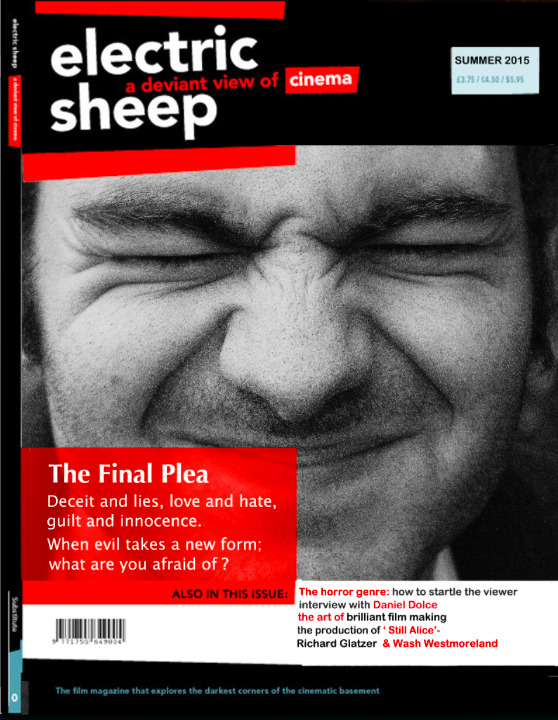
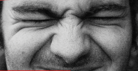
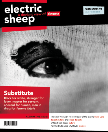
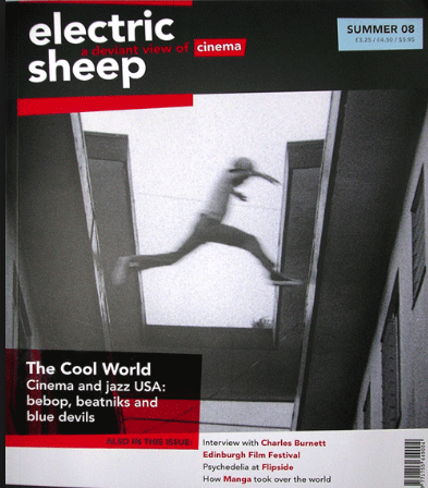
USE: As you can see from the images above, we worked around the basis of the bottom electric sheep magazine. This was due to us wanting to keep a close relationship with some of the magazines that had already been produced so that our magazine would be able to fit in well with with the other magazines and a gained identity for our film would be acquired. The reason we liked the bottom magazine so much is because we felt the man was completely exposed and for the character of the masked man in our film, it is clear he has chose to wear a mask with the intention to hide his face and true identity so we felt this sort of imagery would capture his distress.
DEVELOP:We decided to make the actor pull this facial expression as we wanted the man behind the mask to still not truly reveal his visual features. This is because we felt it would present him as almost quite ashamed of his actions and it would take away any sense of bravery the audience thought he once had as he is unable to look them straight in the eye. This is also why we made our actor close his mouth when squinting, compared to the bottom photograph where the man has his mouth wide open, as we wanted to make him appear as closed as possible. This was with the intention it would create a distance from the audience and so therefore creating a feeling of alienation within them. Another reason we got the actor to display this facial expression is because we wanted to show him as cowardly without the object of the mask in front of him, thus suggesting he gains his bravery and sinister attitude from the mask itself and without it he is nothing.
USE: In order for our own personal electric sheep magazine to be as independent as it could be, we adapted the magazine photo by editing it on Adobe Photoshop and making it black and white. This was something that has been previously touched on in Electric sheep magazines (as shown in the images below). This was beneficial for us as it allowed our magazine to be unique and different, yet still fit comfortably into the expectations of an electric sheep magazine.
The reason we decided to make the image black and white is because we wanted our horror genre to shine through the extensive use of the cold uninviting colours of black and grey. We felt it would make it evident to the viewers that we are not advertising a light hearted comedy film for example and instead we are promoting a film with a very dark and unsettling narrative. Moreover, we felt it would attract the eye of an audience viewer as it is not typical for a magazine to use such a dull coloured image as its front covers. Film goers are attracted to unusual new modern outlooks on the world of film and so by using a black and white image, we felt that this would provide a fresh new perspective.
